Macros | Дата: Вторник, 21.05.2013, 13:08 | Сообщение # 1 |
Оффлайн
Администраторы
Сообщений: 154
IP: Скрытная информация
104
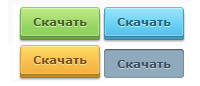
Это очень красивые 3D кнопки на CSS3, в последней версии браузера Internet Explorer кнопки выглядят вполне добротно, правда, градиенты на кнопках не поддерживаются. Вы можете использовать эти 3D кнопки у себя на сайте, в качестве ссылки на скачивание приложенных к материалам файлов. Кнопки имеют приятный эффект при наведении, а при нажатии кнопка становится вдавленной. В кнопке используются CSS градиенты, тени у текста и у самого блока, и, конечно же, округления, как сейчас без них.
Проверено в браузерах Firefox 4, Safari 4, Chrome 13, Opera 10, IE 6.
Установка:
1 шаг. Это ставим в нужное место:
Код <a href="http://dedicated.3dn.ru/" class="button">Скачать</a>
<a href="http://dedicated.3dn.ru/" class="button green">Скачать</a>
<a href="http://dedicated.3dn.ru/" class="button blue">Скачать</a>
<a href="http://dedicated.3dn.ru/" class="button yellow">Скачать</a><br>
<a href="http://dedicated.3dn.ru/" class="button red">Скачать</a>
<a href="http://dedicated.3dn.ru/" class="button purple">Скачать</a>
<a href="http://dedicated.3dn.ru/" class="button grey">Скачать</a>
<a href="http://dedicated.3dn.ru/" class="button black">Скачать</a>
2 шаг. Это ставим с CSS:
Код .button {
margin: 0 0 5px;
height: 28px;
line-height: 28px;
padding: 0 12px;
font-size: 11px;
font-weight: bold;
color: #555555;
text-shadow: 0 1px #fff;
border-width: 1px 1px 0;
border-style: solid;
border-color: #cecece #bababa #a8a8a8;
border-radius: 3px 3px 2px 2px;
outline: none;
-webkit-box-sizing: content-box;
-moz-box-sizing: content-box;
box-sizing: content-box;
display: inline-block;
vertical-align: baseline;
zoom: 1;
*display: inline;
*vertical-align: auto;
background-color: #dfdfdf;
background-image: -webkit-gradient(linear, left top, left bottom, color-stop(0%, #f1f1f1), color-stop(70%, #dfdfdf), color-stop(100%, #dadada));
background-image: -webkit-linear-gradient(top, #f1f1f1 0%, #dfdfdf 70%, #dadada 100%);
background-image: -moz-linear-gradient(top, #f1f1f1 0%, #dfdfdf 70%, #dadada 100%);
background-image: -ms-linear-gradient(top, #f1f1f1 0%, #dfdfdf 70%, #dadada 100%);
background-image: -o-linear-gradient(top, #f1f1f1 0%, #dfdfdf 70%, #dadada 100%);
background-image: linear-gradient(top, #f1f1f1 0%, #dfdfdf 70%, #dadada 100%);
-webkit-box-shadow: inset 0 1px #fdfdfd, inset 0 0 0 1px #eaeaea, 0 1px #a8a8a8, 0 3px #bbbbbb, 0 4px #a8a8a8, 0 5px 2px rgba(0, 0, 0, 0.25);
box-shadow: inset 0 1px #fdfdfd, inset 0 0 0 1px #eaeaea, 0 1px #a8a8a8, 0 3px #bbbbbb, 0 4px #a8a8a8, 0 5px 2px rgba(0, 0, 0, 0.25);
}
.button:hover, .button:active {
text-decoration: none;
background: #dfdfdf;
border-top-color: #c9c9c9;
}
.button:active, .button.green:active, .button.blue:active, .button.yellow:active, .button.red:active, .button.purple:active, .button.grey:active, .button.black:active {
vertical-align: -5px;
margin-bottom: 0;
padding: 1px 13px 0;
border-width: 0;
border-radius: 3px;
-webkit-box-shadow: inset 0 0 3px rgba(0, 0, 0, 0.3), inset 0 1px 1px rgba(0, 0, 0, 0.4), 0 1px white;
box-shadow: inset 0 0 3px rgba(0, 0, 0, 0.3), inset 0 1px 1px rgba(0, 0, 0, 0.4), 0 1px white;
}
.button.green {
color: #465f25;
text-shadow: 0 1px #d9f3b5;
border-color: #91ce5e #7ab04b #5e903f;
background-color: #94d362;
background-image: -webkit-gradient(linear, left top, left bottom, color-stop(0%, #c0eb85), color-stop(70%, #94d362), color-stop(100%, #8ed258));
background-image: -webkit-linear-gradient(top, #c0eb85 0%, #94d362 70%, #8ed258 100%);
background-image: -moz-linear-gradient(top, #c0eb85 0%, #94d362 70%, #8ed258 100%);
background-image: -ms-linear-gradient(top, #c0eb85 0%, #94d362 70%, #8ed258 100%);
background-image: -o-linear-gradient(top, #c0eb85 0%, #94d362 70%, #8ed258 100%);
background-image: linear-gradient(top, #c0eb85 0%, #94d362 70%, #8ed258 100%);
-webkit-box-shadow: inset 0 1px #d9f3b5, inset 0 0 0 1px #b1e095, 0 1px #5e903f, 0 3px #6da445, 0 4px #5e903f, 0 5px 2px rgba(0, 0, 0, 0.4);
box-shadow: inset 0 1px #d9f3b5, inset 0 0 0 1px #b1e095, 0 1px #5e903f, 0 3px #6da445, 0 4px #5e903f, 0 5px 2px rgba(0, 0, 0, 0.4);
}
.button.green:hover, .button.green:active {
background: #94d362;
border-top-color: #82bd53;
}
.button.blue {
color: #236277;
text-shadow: 0 1px #c2ecf9;
border-color: #6fbad1 #3fa3c0 #3583ab;
background-color: #61cdf3;
background-image: -webkit-gradient(linear, left top, left bottom, color-stop(0%, #9be5fa), color-stop(70%, #61cdf3), color-stop(100%, #5fbde8));
background-image: -webkit-linear-gradient(top, #9be5fa 0%, #61cdf3 70%, #5fbde8 100%);
background-image: -moz-linear-gradient(top, #9be5fa 0%, #61cdf3 70%, #5fbde8 100%);
background-image: -ms-linear-gradient(top, #9be5fa 0%, #61cdf3 70%, #5fbde8 100%);
background-image: -o-linear-gradient(top, #9be5fa 0%, #61cdf3 70%, #5fbde8 100%);
background-image: linear-gradient(top, #9be5fa 0%, #61cdf3 70%, #5fbde8 100%);
-webkit-box-shadow: inset 0 1px #c5f0fd, inset 0 0 0 1px #8ad1eb, 0 1px #3583ab, 0 3px #3f9db8, 0 4px #3583ab, 0 5px 2px rgba(0, 0, 0, 0.4);
box-shadow: inset 0 1px #c5f0fd, inset 0 0 0 1px #8ad1eb, 0 1px #3583ab, 0 3px #3f9db8, 0 4px #3583ab, 0 5px 2px rgba(0, 0, 0, 0.4);
}
.button.blue:hover, .button.blue:active {
background: #61cdf3;
border-top-color: #3eaac9;
}
.button.yellow {
color: #7e4f27;
text-shadow: 0 1px #f2e294;
border-color: #efb443 #d9a238 #a57825;
background-color: #f6ba49;
background-image: -webkit-gradient(linear, left top, left bottom, color-stop(0%, #ffdd67), color-stop(70%, #f6ba49), color-stop(100%, #f4b03e));
background-image: -webkit-linear-gradient(top, #ffdd67 0%, #f6ba49 70%, #f4b03e 100%);
background-image: -moz-linear-gradient(top, #ffdd67 0%, #f6ba49 70%, #f4b03e 100%);
background-image: -ms-linear-gradient(top, #ffdd67 0%, #f6ba49 70%, #f4b03e 100%);
background-image: -o-linear-gradient(top, #ffdd67 0%, #f6ba49 70%, #f4b03e 100%);
background-image: linear-gradient(top, #ffdd67 0%, #f6ba49 70%, #f4b03e 100%);
-webkit-box-shadow: inset 0 1px #ffeca6, inset 0 0 0 1px #e5c96d, 0 1px #a57825, 0 3px #c08a28, 0 4px #a57825, 0 5px 2px rgba(0, 0, 0, 0.4);
box-shadow: inset 0 1px #ffeca6, inset 0 0 0 1px #e5c96d, 0 1px #a57825, 0 3px #c08a28, 0 4px #a57825, 0 5px 2px rgba(0, 0, 0, 0.4);
}
.button.yellow:hover, .button.yellow:active {
background: #f6ba49;
border-top-color: #e5ab3d;
}
.button.red {
color: #702526;
text-shadow: 0 1px #ea8f99;
border-color: #e1696e #c85252 #a03a38;
background-color: #e46565;
background-image: -webkit-gradient(linear, left top, left bottom, color-stop(0%, #eb9093), color-stop(70%, #e46565), color-stop(100%, #e25755));
background-image: -webkit-linear-gradient(top, #eb9093 0%, #e46565 70%, #e25755 100%);
background-image: -moz-linear-gradient(top, #eb9093 0%, #e46565 70%, #e25755 100%);
background-image: -ms-linear-gradient(top, #eb9093 0%, #e46565 70%, #e25755 100%);
background-image: -o-linear-gradient(top, #eb9093 0%, #e46565 70%, #e25755 100%);
background-image: linear-gradient(top, #eb9093 0%, #e46565 70%, #e25755 100%);
-webkit-box-shadow: inset 0 1px #dcaaaa, inset 0 0 0 1px #df777a, 0 1px #a03a38, 0 3px #be4b49, 0 4px #a03a38, 0 5px 2px rgba(0, 0, 0, 0.4);
box-shadow: inset 0 1px #dcaaaa, inset 0 0 0 1px #df777a, 0 1px #a03a38, 0 3px #be4b49, 0 4px #a03a38, 0 5px 2px rgba(0, 0, 0, 0.4);
}
.button.red:hover, .button.red:active {
background: #e46565;
border-top-color: #d0585a;
}
.button.purple {
color: #714667;
text-shadow: 0 1px #f2c5e6;
border-color: #e391d0 #c27ab3 #8a517d;
background-color: #e393d3;
background-image: -webkit-gradient(linear, left top, left bottom, color-stop(0%, #f1bee3), color-stop(70%, #e393d3), color-stop(100%, #df8dce));
background-image: -webkit-linear-gradient(top, #f1bee3 0%, #e393d3 70%, #df8dce 100%);
background-image: -moz-linear-gradient(top, #f1bee3 0%, #e393d3 70%, #df8dce 100%);
background-image: -ms-linear-gradient(top, #f1bee3 0%, #e393d3 70%, #df8dce 100%);
background-image: -o-linear-gradient(top, #f1bee3 0%, #e393d3 70%, #df8dce 100%);
background-image: linear-gradient(top, #f1bee3 0%, #e393d3 70%, #df8dce 100%);
-webkit-box-shadow: inset 0 1px #f5d6ee, inset 0 0 0 1px #dcaacf, 0 1px #8a517d, 0 3px #a7619a, 0 4px #8a517d, 0 5px 2px rgba(0, 0, 0, 0.4);
box-shadow: inset 0 1px #f5d6ee, inset 0 0 0 1px #dcaacf, 0 1px #8a517d, 0 3px #a7619a, 0 4px #8a517d, 0 5px 2px rgba(0, 0, 0, 0.4);
}
.button.purple:hover, .button.purple:active {
background: #e393d3;
border-top-color: #c87eb8;
}
.button.grey {
color: #41505b;
text-shadow: 0 1px #c2d0db;
border-color: #909eab #768791 #50606e;
background-color: #90aabd;
background-image: -webkit-gradient(linear, left top, left bottom, color-stop(0%, #bccbd7), color-stop(70%, #90aabd), color-stop(100%, #83a0b4));
background-image: -webkit-linear-gradient(top, #bccbd7 0%, #90aabd 70%, #83a0b4 100%);
background-image: -moz-linear-gradient(top, #bccbd7 0%, #90aabd 70%, #83a0b4 100%);
background-image: -ms-linear-gradient(top, #bccbd7 0%, #90aabd 70%, #83a0b4 100%);
background-image: -o-linear-gradient(top, #bccbd7 0%, #90aabd 70%, #83a0b4 100%);
background-image: linear-gradient(top, #bccbd7 0%, #90aabd 70%, #83a0b4 100%);
-webkit-box-shadow: inset 0 1px #d0dae2, inset 0 0 0 1px #99b5ce, 0 1px #50606e, 0 3px #627786, 0 4px #50606e, 0 5px 2px rgba(0, 0, 0, 0.4);
box-shadow: inset 0 1px #d0dae2, inset 0 0 0 1px #99b5ce, 0 1px #50606e, 0 3px #627786, 0 4px #50606e, 0 5px 2px rgba(0, 0, 0, 0.4);
}
.button.grey:hover, .button.grey:active {
background: #90aabd;
border-top-color: #8495a0;
}
.button.black {
color: #f1f1f1;
text-shadow: 0 1px #111;
border-color: #505050 #414141 #2c2c2c;
background-color: #4f4f4f;
background-image: -webkit-gradient(linear, left top, left bottom, color-stop(0%, #696969), color-stop(70%, #4f4f4f), color-stop(100%, #3c3c3c));
background-image: -webkit-linear-gradient(top, #696969 0%, #4f4f4f 70%, #3c3c3c 100%);
background-image: -moz-linear-gradient(top, #696969 0%, #4f4f4f 70%, #3c3c3c 100%);
background-image: -ms-linear-gradient(top, #696969 0%, #4f4f4f 70%, #3c3c3c 100%);
background-image: -o-linear-gradient(top, #696969 0%, #4f4f4f 70%, #3c3c3c 100%);
background-image: linear-gradient(top, #696969 0%, #4f4f4f 70%, #3c3c3c 100%);
-webkit-box-shadow: inset 0 1px #828282, inset 0 0 0 1px #555555, 0 1px #2c2c2c, 0 3px #444444, 0 4px #2c2c2c, 0 5px 2px rgba(0, 0, 0, 0.4);
box-shadow: inset 0 1px #828282, inset 0 0 0 1px #555555, 0 1px #2c2c2c, 0 3px #444444, 0 4px #2c2c2c, 0 5px 2px rgba(0, 0, 0, 0.4);
}
.button.black:hover, .button.black:active {
background: #4f4f4f;
border-top-color: #494949;
}

| |
|
| |


